A good story is a powerful thing. In the often-dull world of business speak and technical jargon, weaving a story into the message you’re trying to convey can engage readers that might otherwise lose interest.
However, information is paramount, and a beguiling narrative often depends on more than just words. It also needs signposts that guide your audience on the journey you promised them. This is where layout design comes in. How you present the information on your document can greatly enhance the reading experience to one that is comfortable, engaging and even pleasant.
We’ve shared our take-aways below.
Break up text
Concentration is fickle, headstrong and changeable. A long block of text is an invitation to pursue more intriguing distractions. Have you ever stared at a wall for entertainment? Hopefully not, because it’s boring. And so is an unbroken chunk of words.
Here are a few go-tos that you can use to give your audience’s eyes a break, some which speak for themselves, and others that we’ve expanded on:
- Headers
- Concise paragraphs
- Bullet points
- Photos
- Graphs, tables and infographics
- Colour
- White space
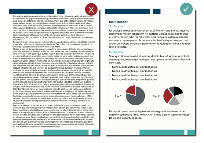
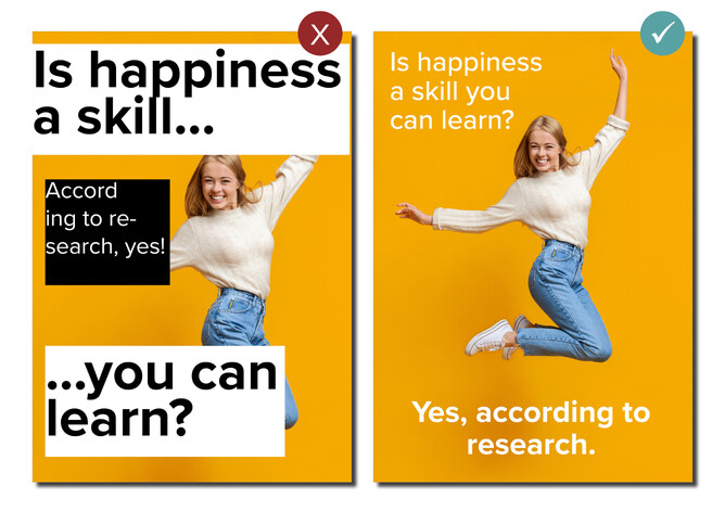
While both documents say absolute gibberish (a.k.a., Lorem Ipsum or placeholder text), the one on the right breaks up the content and is much easier to take in at a glance.
Photos
To butcher a popular saying, a picture says loads of stuff.
It can tell you who wrote the thing you’re reading and humanise the words in front of you. Think Executive Summaries in work-winning proposals or photographs of authors.
Pictures demonstrate the reality of something, expectations, goals and pledges. Imagine mock-ups of products or infrastructure projects (e.g., BIM, 3D renders or architectural drawings). These assets make it easier for your audience to understand your message, especially complex concepts. Photographs and pictures are versatile and can match any narrative tone. Not only do they support your words, but they add variety to the learning process your audience is undergoing.
Remember to use high-resolution images, too. Anything that’s blurry or low quality makes your reader focus on those flaws, as opposed to the story you’re trying to tell (or sell!).
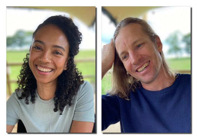
Hi! We’re Patrice and Brand, the creatives behind S&K.
Would you consider us lifelong friends now? Nope. But this is what we look like and hopefully we’ve caught your attention.
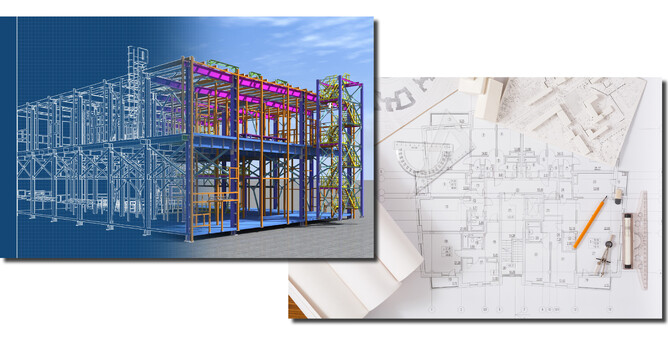
Images, such as BIM renders or architectural drawings, help your audience visualise your points.
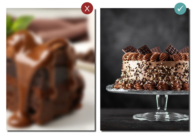
One of these cakes looks appetising.
Remember to use high-resolution images that work with, not against your messaging.
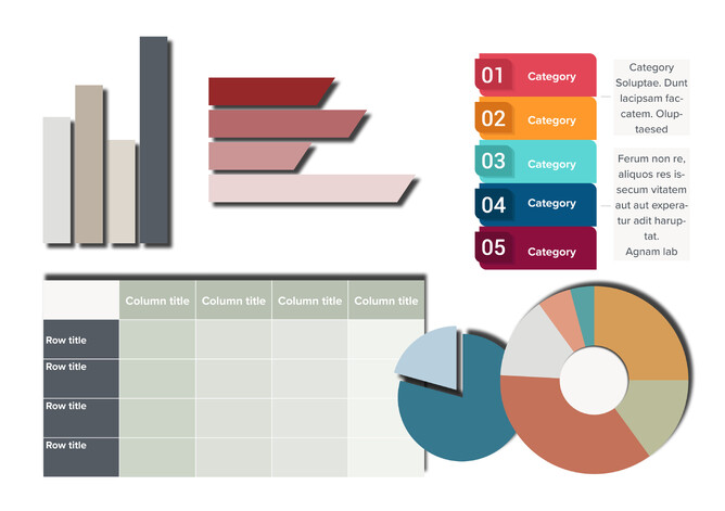
Graphs, tables and infographics
You can tell a story in many ways.
As with pictures and photographs, visual tools can boost your audience’s comprehension and spice up how you engage with them. Graphs, tables and infographics are immediate examples of creative ways you can share information while keeping your reader stimulated.
Colour
You can add a splash of colour to even the driest of content. Basic examples are including your brand colours in headings, page numbers, section dividers, footnotes, contact information and any other subtle identifiers.
More expressive examples encompass the visual tools mentioned earlier. If your branding is flexible, explore colour palettes that match the tone or strategy of your work. For example, black and white are the primary brand colours at S&K. They provide us with consistency and the freedom to play with colour depending on our needs. But we’ve also used purple for our sports biographies wing, as this feels more playful and separate from the technical and copywriting side.
A quick web search will give you various generators if you struggle with organising and matching hues.
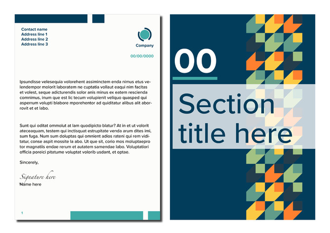
Colour can support your text without distracting from it and clearly organise document topics.
White space
A.k.a., negative space. However, don’t be afraid. White space is your friend and refers to the empty areas around your content. It’s useful for letting the elements on your page breathe. It also ensures your audience isn’t confused or overwhelmed by too much text or other functional elements.
White space respects boundaries and allows your content to breathe.
Research and inspiration
Whether you’re a design expert or learning as you go, the success of others can spur your layout design adventure.
When our creative well runs dry at S&K, we explore resources such as Adobe Stock for inspiration. You don’t need a subscription to explore its assets, and it also has free options for templates, images, hi-res images and vectors. This is not an invitation to directly copy someone else’s work. However, getting out of your own head and seeing what other experts are doing is a great way to release the creative juices or problem solve a design dilemma that’s stopping your productivity.
Additionally, researching your subject matter is crucial for effective knowledge sharing. It provides themes and tools relevant to your messaging. As such, proper research informs the appropriate correct images, colour palettes and other visual tools necessary for bolstering your text.
Give your ego a break. Learning from other designers can boost your creativity and assist in problem solving.
Respect the clock
Document layout design can be time-consuming. Conveying relevant information in non-text formats requires creativity and problem solving.
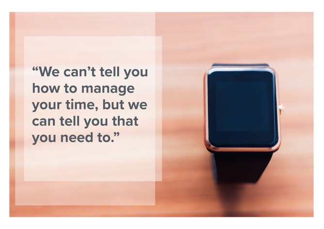
When you can, set aside dedicated time for researching and planning. A good story, whether it’s a tender proposal, advertising brief or fantasy fiction, is a holistic endeavour born from many influences. We can’t tell you how to manage your time, but we can tell you that you need to.
This advice is equally important if you’re on the side-lines. We acknowledge that many project briefs require professionals to bend space and time to meet a deadline. Where possible, plan appropriately so that your creative can source, compile and design your document to the best of their ability. Rushing a job risks ineffective communication.
Last words
These approaches to document layout design work for us and hopefully will work for you. When all else fails, remember that you are hosting your readers, and must do all that you can to make their stay as comfortable and memorable as possible. To share information clearly, keep the following in mind:
- Break up all that text.
- Throw in some bullet points to keep things concise.
- Use headers.
- Harness relevant images of yourself, your project, your accomplishments, etc.
- Play with tables and graphs to convey statistics and data.
- Explore infographics to quickly share knowledge.
- Seek inspiration elsewhere.
- White space is not the enemy.
Here are also some image and vector resources with free options:
Key take-away
If you’ve enjoyed this blog but still can’t be bothered with layout, then get in touch.